
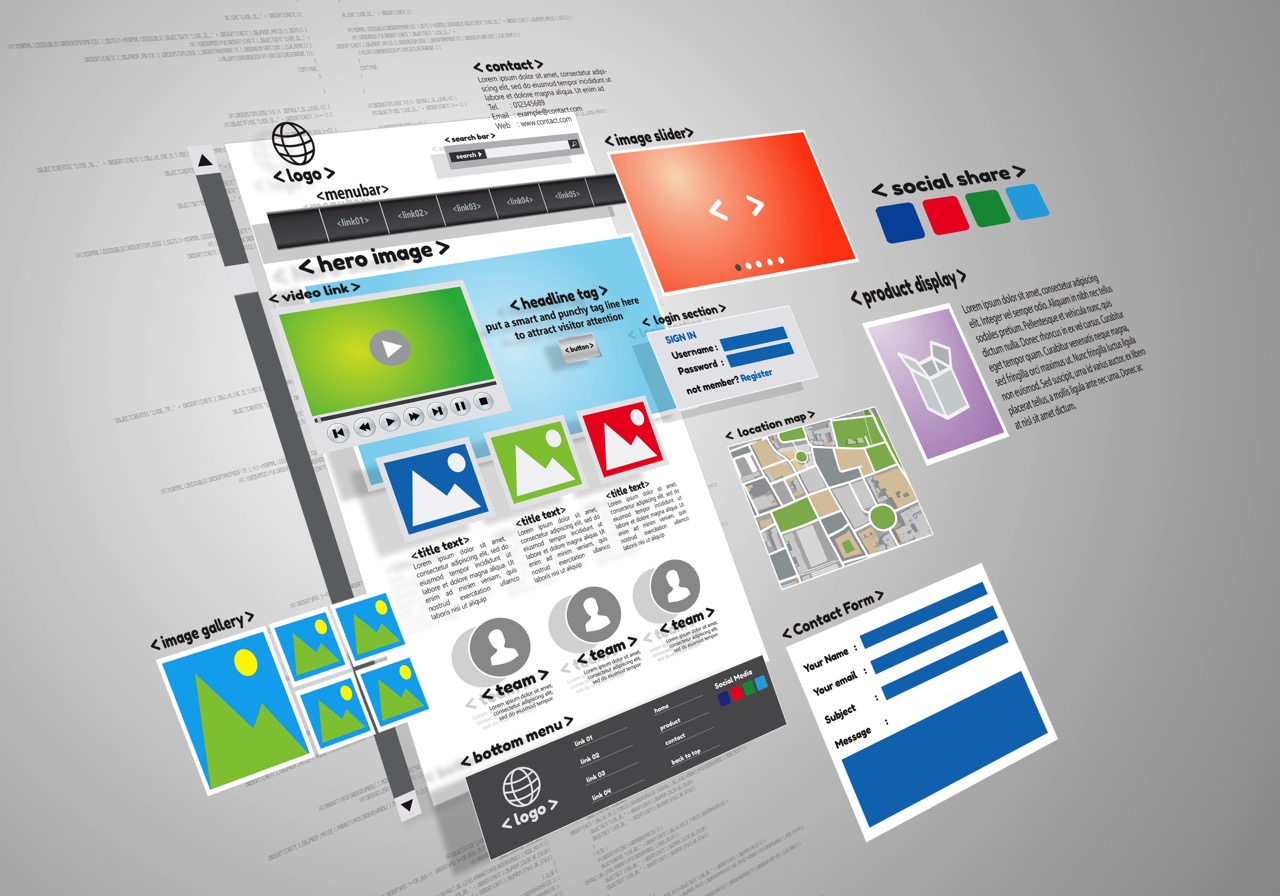
Building a website today is a bit like assembling IKEA furniture – it looks simple in the beginning, but once you start, you realise that those instructions aren’t quite as clear as they seemed. Sure, there are drag-and-drop builders, and templates that promise the moon, but trust me, making a website that’s not just pretty but actually works for your business? That’s the real challenge.
In this blog, I will talk about seven common mistakes that web designers often make when building websites. Avoiding these will set your website on the path to success – or at least keep you away from wanting to throw your computer out the window.
1. Not understanding the business or industry
Imagine a chef creating a menu without knowing what kind of restaurant he’s cooking for. Fish cutlets at a vegan café? Not ideal. The same goes for web design. Web designers must dive deep into the client’s business, understand its pain points, and, more importantly, get a grip on what the client’s customers actually need. If you don’t know what problems your client’s customers want solved, you’re just serving up content that won’t impress your prospects.
One of my client hired an elite design agency to build their corporate presentation designs and I was part of that meeting. After a lead time of almost a week, folks who chaired the meeting didn’t bother to do any research about my client’s business.
2. Design first, content later – aka cart before the horse
You’ve seen it before. Designers find a theme that dazzles, clients love it because it “looks cool,” and then the content gets awkwardly stuffed in wherever it fits. It’s like picking out a fancy frame before you’ve painted the picture.
Here’s the thing: Your website is a message, not just a pretty face. The content should guide the design, not the other way around. Think of it as a solid foundation (content) before building the walls (design). Otherwise, you end up with a lovely but soulless website, like those cookie-cutter show homes – beautiful to look at, but empty inside.
One must establish clarity on the purpose of the website. That purpose must be defined and clearly articulated – and then followed through the letter as project progresses.
3. Overcomplicating design in the name of ‘standing out’
Sure, everyone wants a website that feels unique. But there’s a fine line between creative and confusing. Some designers get so caught up in making something “different” that they forget the golden rule: Visitors are busy – keep it simple. They don’t have time to to find the page that provides them the info they are looking for.
Complex navigation, hidden menus, or too many click-happy animations, ever-scrolling sections can leave your visitors feeling like they’re navigating a maze. Keep it simple, clean, and intuitive. Trust me, your visitors will thank you for not making them work too hard. Specially, poor navigation will frustrate your visitors.
This becomes even more crucial when dealing with limited screen space on mobile devices, where visitors might be navigating your website while on the move, in noisy environments, or even under bright sunlight. Ensure your design and colour choices are optimised for a wide range of conditions, so your site remains user-friendly no matter where or how it’s being accessed.
4. Content writers and their love affair with Google spiders
Now let’s talk about content writers. You know, the ones who get so caught up with Google rankings and keywords that they start repeating the same phrases over and over, as if their keyboards have malfunctioned. Yes, on-page SEO is important, but let’s not forget that your website is for human beings, not Google spiders.
Raise your hand if you’ve ever landed on a website and been hit with phrases like “synergise your disruptive innovation.” My hand’s up. Fluffy marketing jargon doesn’t help anyone. The key is to speak the language of your audience. The content should be clear, direct, and aligned with the cognitive level of the people visiting your site. If they don’t understand what you’re saying, they won’t stick around to figure it out.
And while we’re on the subject of content, let’s not forget about the SEO obsession. Yes, keywords are important, but content should always speak to human beings first. Loading up pages with keywords to appease Google’s algorithm might get you ranked, but it won’t get you loyal customers. Remember, your audience is not a Google spider, it’s a real person, so make sure your language stays human.
5. Ignoring brand personality in design
A website isn’t just about functionality or aesthetics – it’s about how your brand comes across to your audience. Are you a serious, formal brand, or do you want to sprinkle a bit of fun into your personality? These are critical decisions that need to be reflected in your website’s design and content.
Web designers and content writers must understand their client’s brand personality. After all, once the website does its job, the team that carries the conversation forward in pre-sales or sales shouldn’t sound like a completely different entity. A consistent tone and personality across the website and sales conversations are key to building trust. Whether you’re quirky or corporate, the website should give visitors the same experience they can expect from dealing with your team.
6. Not making full use of the platform
When it comes to websites, a majority of web designers will choose WordPress. Others might prefer website builders like Wix, SquareSpace, or Webflow. The lazy ones will pick templated website publishers. Unfortunately, many rely on unlicensed or free versions of plugins.
Now, would you drive a car that isn’t regularly serviced or trust it with an untrained mechanic? Or better yet, would you service your BMW yourself? Probably not. The same logic applies to websites. It’s crucial that your web designer understands the platform they’re working with, ensuring it’s deployed to its full potential, both in terms of functionality and features.
While modern website builders can help you get the basics right, when it comes to more complex configurations, you’ll need someone who truly knows what they’re doing. Only an expert can ensure your website performs as smoothly as it should.
7. Finally, the home page fiasco
Your homepage is like the introduction to a great book. It should draw people in, engage them, and then lead them where they need to go. What it shouldn’t do is overwhelm visitors with images that mean nothing or look like a digital art gallery with no sense of direction.
Instead, think of the homepage as a well-organised index. You want it to clearly guide your visitor to the information they’re looking for, building trust along the way. Skip the hard sell; focus on demonstrating credibility. A user that trusts your site will naturally take the next steps.
Summing it up
Creating a website requires planning, insight, and, a little common sense. One must first establish clarity on the purpose of the website. What is its goal? to inform? to sell? to build trust? that purpose must be defined and clearly articulated from the outset, serving as a guiding principle throughout the entire project. Without this clarity, design decisions shall be made in a vacuum, and the result will often be a pretty website that misses the mark.
A solid understanding of the purpose will ensure that both the design and content work together seamlessly to achieve your business goals. I always say, making a website is a fine blend of art and science. Strike a balance and let’s keep the websites simple, functional, and free from unnecessary confusion – and, please, no more treasure hunts!